One Hundred Years of Photo Wallets
by Annebella Pollen, Professor of Visual and Material Culture at University of Brighton
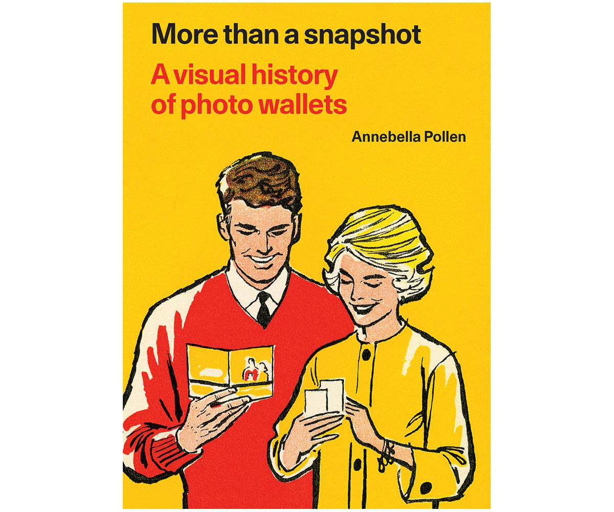
Our Book of the Month is More Than A Snapshot: A Visual History of Photo Wallets by Annebella Pollen in which the author shares her collection of British 20th century photo wallets.
Before digital cameras, you would leave your camera film with a company to develop your photographs, and they would return them to you in paper envelopes. These were commonly known as photo wallets.
To celebrate the launch of her book, in a fascinating interview, Annebella talks to us about the history of illustration of photo wallets and what they tell us about the leisure pursuits and social attitudes of the time (including a description of racist imagery) and how limited ideas of Britishness were presented.
It’s wonderful to see so much of your collection in this book: what made you start collecting photo wallets?
It was really by chance. I have been researching the history of amateur photography for about twenty years, and collected occasional photographs, albums and advertising that caught my eye from time to time. But around a decade ago, my partner – a longstanding bric-a-brac dealer – started working for a house clearance company. It is very common for there to be personal photographs among the possessions left behind after someone dies; there are usually old suitcases or shoeboxes of old photos in attics, under beds or on top of wardrobes. They are frequently still left in the paper wallets that they came in from the processors. My partner would bring the photographs home. He’d tip them out of their paper wallets, as these had no resale value. I liked their designs and thought them too good to throw away. I now have hundreds of examples covering a hundred years.
Why did you decide to tell the visual history of the photo wallet in this book?
It is perhaps perverse to write a history of popular photography not through photographs but through the packaging they came in. But photo wallets seem to me to offer a new view of how photography was popularised and shaped over a century. When a hundred years of photo wallets are seen together, they show the companies and services that supported snapshot photography; they show how it was mediated and promoted, and they show how its technologies and practices changed over time.
How important is illustration to photo wallets?
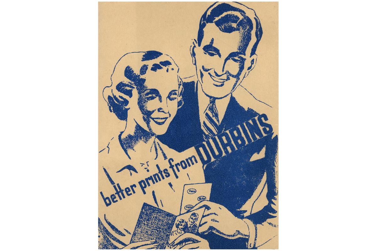
Very important! They are a very visual form. Photo wallets were initially devised in 1908 by the American company Kodak as a simple and practical way to return photographic prints and negatives to customers after they had their films processed. But they were also silent salespeople, putting the company’s name into consumer’s hands. They often carried some advertising for photographic products and some photographic advice. They almost always carry some kind of illustration, often showing suitable photographic subject matter (for example, holidays and families) or images of photographers (most usually a woman, as snapshot photography was especially marketed to women). When photo wallets began to include photographs in their designs, commonly from the mid-20th century, they showed consumers what their photographs could look like, at best. They also sometimes showed what they should not look like when they included more realistic rogues’ galleries of bad photographs so photographers could understand where they went wrong. The illustrations were instructive as well as decorative.
It is fascinating to see how photo wallets have changed in size, shape, style, and design throughout the years. Has the use of illustration on these wallets changed over time?
There are certain subjects for photography that endure across a century of photo wallets – babies, children and pets, for example. These domestic subjects stay the same even as the colourways and typography move with the times. Graphic design styles change faster than photographic fashions.
For much of the 20th century, before digital cameras made it possible to take greater volumes of photographs without additional cost, most people took merely one or two rolls of film a year. These films were mostly taken on special occasions, such as on holiday. In early 20th century Britain, when holidays were largely taken in rural and seaside locations, shorelines and beach scenes are prominent subjects on wallets. By the end of the century, locations became more international and aspirational. Photo wallets begin to include images of the Eiffel Tower [in Paris] and the Golden Gate Bridge [in San Francisco].
Before flash became widespread, most photographs taken with simple-to-operate cameras had to be taken outdoors. When this changed in the 1950s, flashes and sparkles begin to appear as motifs on wallets. In the 1960s, when colour photography becomes more common and affordable, wallets begin to include photographs infused with saturated primary colours, as well as prisms, three colour lenses and rainbow lettering in their designs. Photo wallets might seem quaint to us now, but they were once platforms for showing the latest technologies and newest trends.
As photo-processing moved from being a modest early 20th century cottage industry, with photographs printed by hand in the back rooms of local chemists, to a large-scale mechanised industry monopolised by major providers, photo wallets moved from homely line drawings produced by family-run firms to slick operations led by companies with big advertising budgets. The imagery becomes less about personal service and more about speed, scale, reliability and uniformity. This can be seen in the design of wallets from the 1980s: they become bigger and glossier, and they shout their descriptive brand names (Foto Post and Snappy Snaps, for example) in a crowded marketplace where big fortunes could be made from the millions of camera owners.
Why do you think illustration was often used over photography on photo wallets?
This is a story of print technology and cost. Photo wallets in the early 20th century were mostly simply printed on soft paper; they were cheaply made and not designed to be kept. They are part of the category of cultural material called ephemera: that which was designed merely to serve a quick purpose and then to be thrown away. They are the equivalent, perhaps, of a paper bag from a corner shop. Line drawings were easier and cheaper to reproduce for this kind of quick, functional purpose. Photographs begin to appear as fuzzy halftone black-and-white printed images on photo wallets from around the 1950s, when they co-exist with line drawings. As photographic reproduction became more reliable, line drawings fell out of favour.
In the book you mention British illustrators, Fred Pegram, Claude Shepperton and A. Wallis Mills, specifically the work they did for the long-running Kodak Girl series of photo wallets introduced in 1910. Have there been other notable illustrators who have designed photo wallets over the years?
Most photo wallets sadly do not include credited names for their illustrators. The commercial artists mentioned above, however, sometimes included their signatures in their work, and they were part of a wider set of illustrative practices used by Kodak, who were a very wealthy company who invested heavily in advertising. Kodak commissioned leading illustrators who were already well-known in the illustrated press. They used these illustrators widely in their advertising campaigns. The Kodak Girl, for example, took many guises in her life and was drawn in many different styles by different artists. She was used on Kodak’s posters and other promotional materials – such as shop window displays – far beyond photo wallets, for over fifty years.
Outside of photography companies with big budgets, many of the early 20th century photo wallets in my collection come from now-defunct local service providers who most likely employed the services of jobbing printers, designers and illustrators who remain unknown to us today. It is likely that the commercial artists producing their illustrations took on many small jobs of this kind to meet the needs of the advertising industry as it became increasingly reliant on visual messaging.
Do you have a favourite photo wallet in your collection?
It is hard to choose. I really like those that show women as photographers. I am also very keen on photo wallets that show images of photo wallets – the kind of picture-within-a-picture that art historians call mise en abyme.
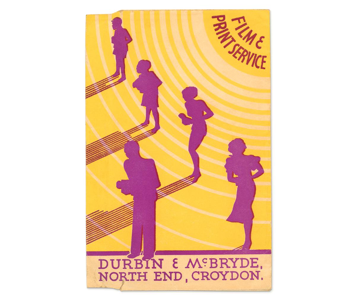
But perhaps the one that I like best is by a company called Durbin & McBryde from Croydon, now long gone. I like it because it shows, in dramatic purple silhouette, a man, woman, boy and girl, all with cameras in their hands, standing with their backs to the sun. With a very striking modernist graphic style, it shows photography’s democratic appeal to all ages and genders, while demonstrating a photographic golden rule: keep your light source behind you. I like that it does this by showing rather than telling.
Are there any challenging social questions the photo wallets raise?
My collection focuses on British photo wallets. I am interested in those that communicate nationalist themes and messages, for good or for ill. Some camera companies promoted their supplies as ‘British film for British people’. I find it interesting how these kinds of narratives were both full of patriotic pride and quite xenophobic. Britishness was always equated with whiteness in these discussions. Not only is there not a single black or brown person depicted in any one of the hundreds of photo wallets in my collection, but there are also racist photo wallets. These show how normalised white supremacy was in British popular culture throughout the 20th century. The only black figures are cartoon caricatures in grass skirts under palm trees, or golliwogs [dolls based on racist caricatures] photographed in the arms of white children. These are the most challenging wallets in my collection, but perhaps the most revelatory of social attitudes.
Was there anything surprising that you discovered about photo wallets whilst researching this book?
Any visual history must always consider what is not pictured. Photo wallets always show happy families and sunny days; they don’t usually show the shadowy labour behind the scenes. Photo wallets are overlooked ephemera, but what is perhaps more overlooked is the industry that underpins photo processing. Not only were women the main subjects of snapshot photographic marketing, and the main consumers of developing and printing, but they were also most likely to be doing the factory work operating the machines. I enjoyed bringing these darkroom stories to light, especially when they involved exploited workers standing up to their employers. In 1976-1978 there was a major strike in Britain. It was of the most significant industrial actions of the decade, not least because it was led by South Asian women. It took place at Grunwick photo-processing labs in Willesden, North London; what has been forgotten is that cheap photo processing was at its heart.